THE CHALLENGE
How can we create a visual identity that gives the new MHI Vestas Japan a head start?
THE SOLUTION
By rooting the CVI in the strong parent company legacy, customer relationship and recognition – while capturing new ambitions.
A CVI with history
The corporate identity for MHI Vestas Japan is rooted in the first joint venture between Mitsubishi Heavy Industries and Vestas, also known as the former MHI Vestas Offshore Wind.
The MHI Vestas Japan CVI is visually created to preserve the great legacy through explicit visual references to note the joint venture’s bond and history and its aspirations for the future.
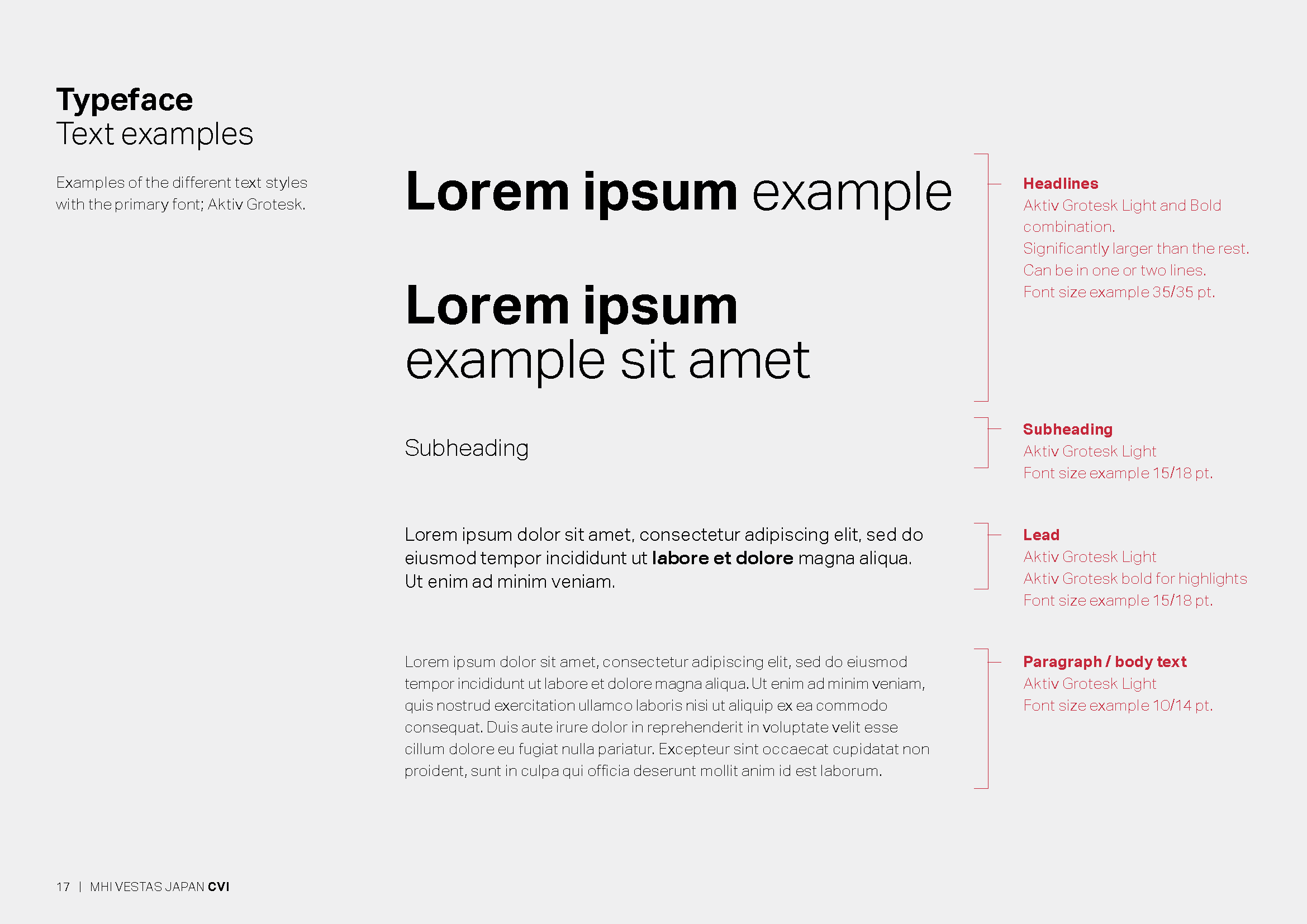
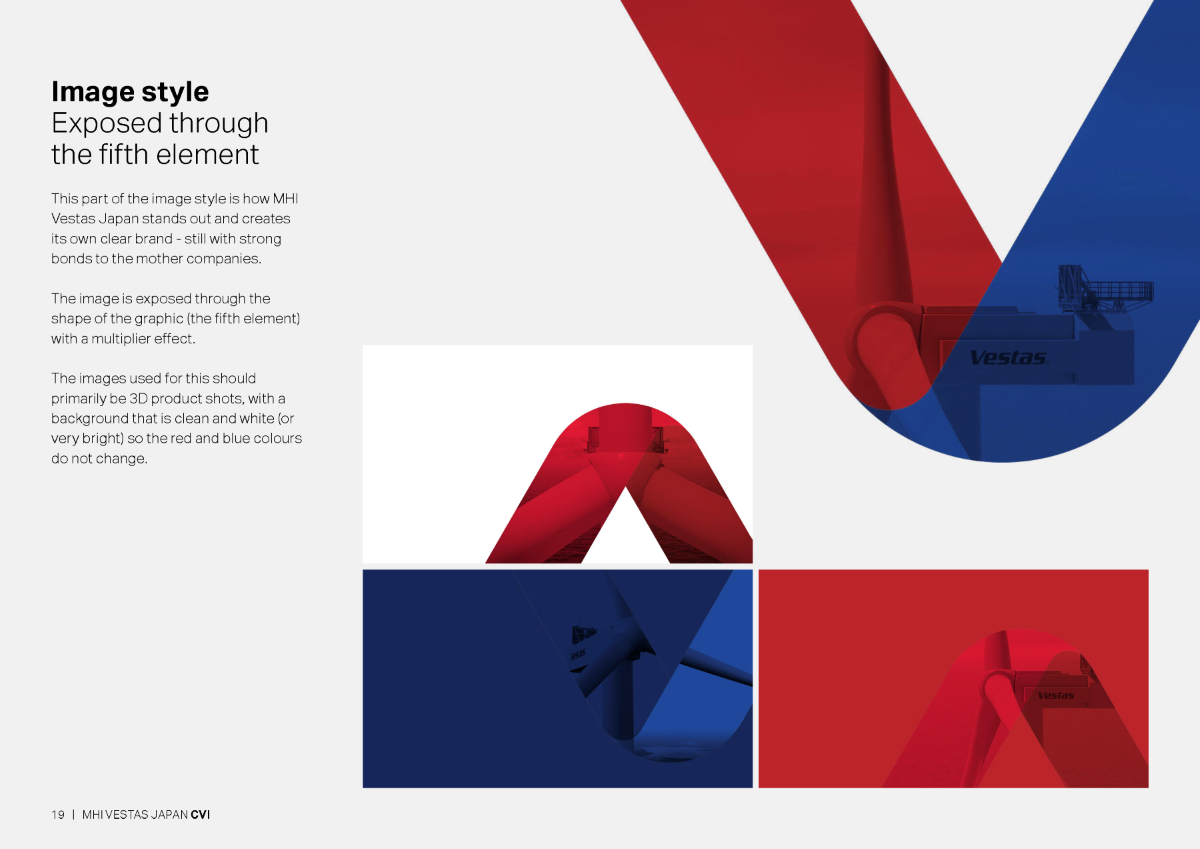
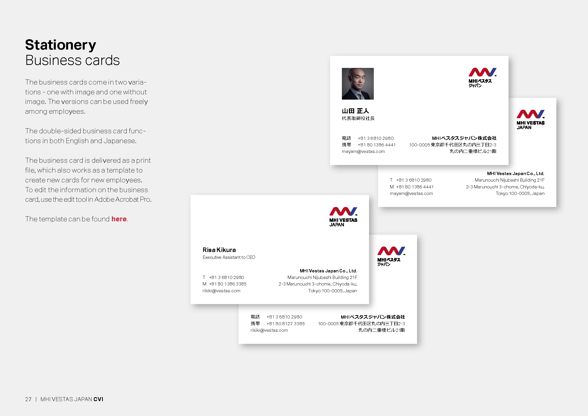
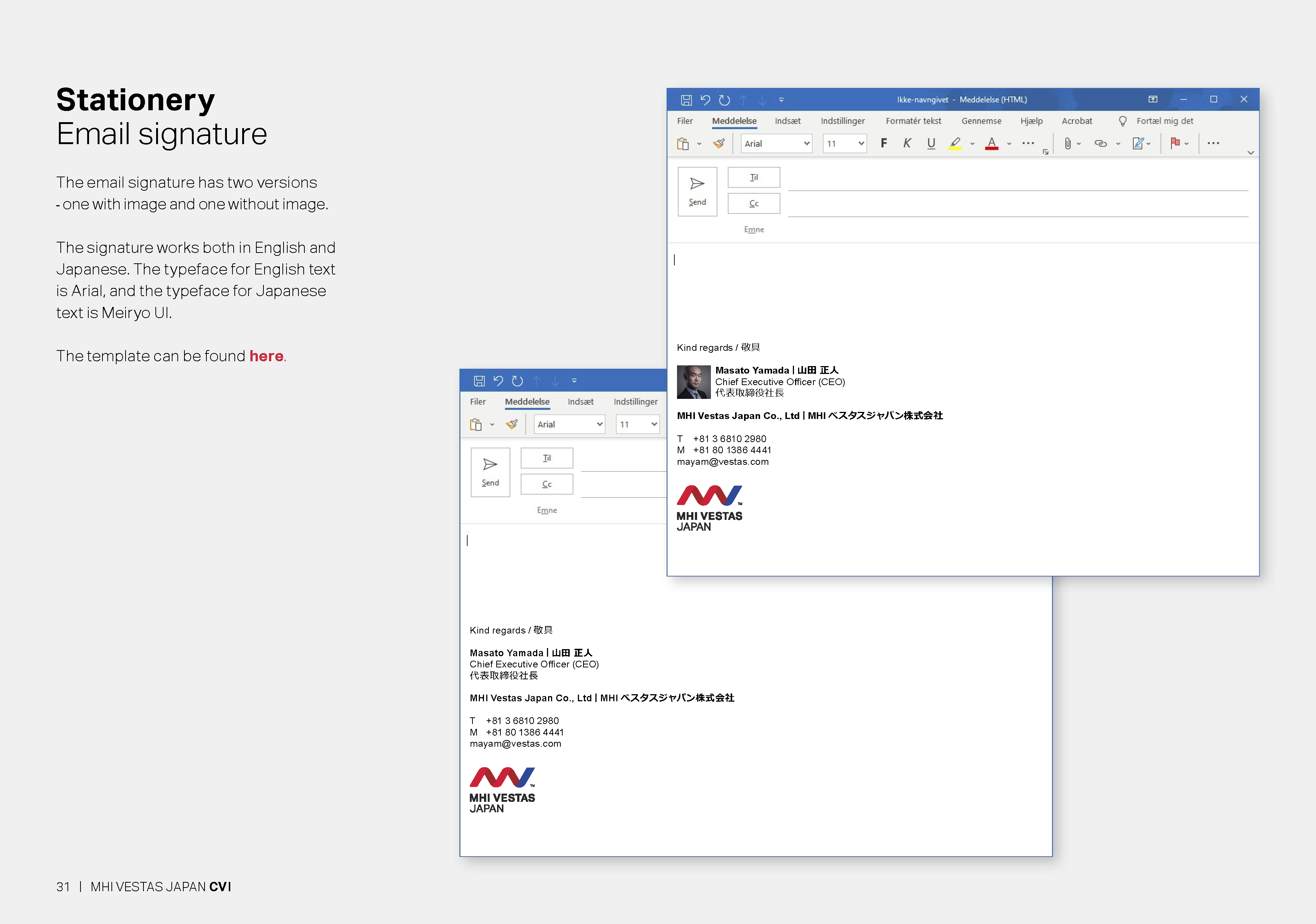
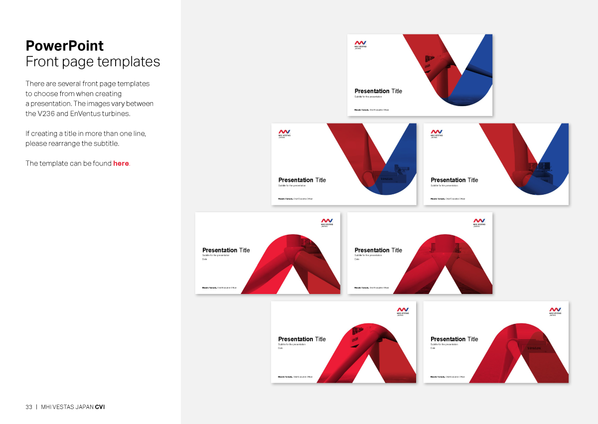
See some of the elements of MHI Vestas Japan’s new CVI booklet below:
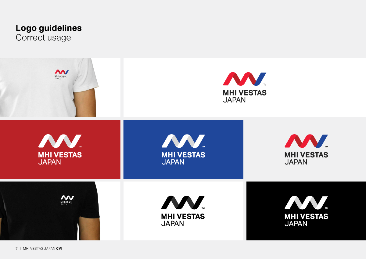
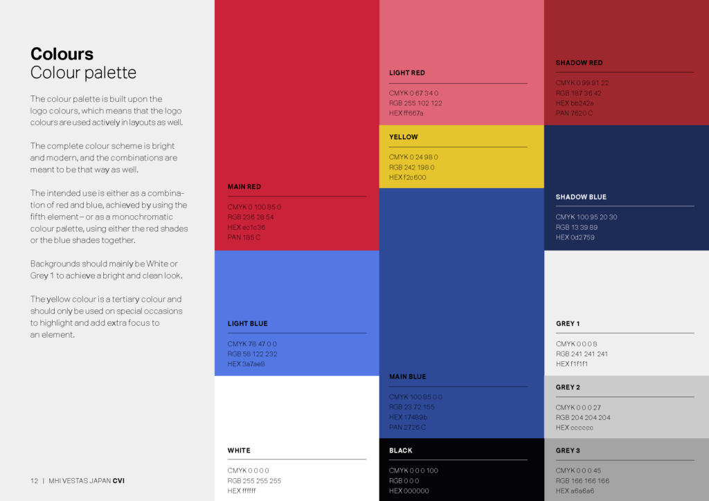
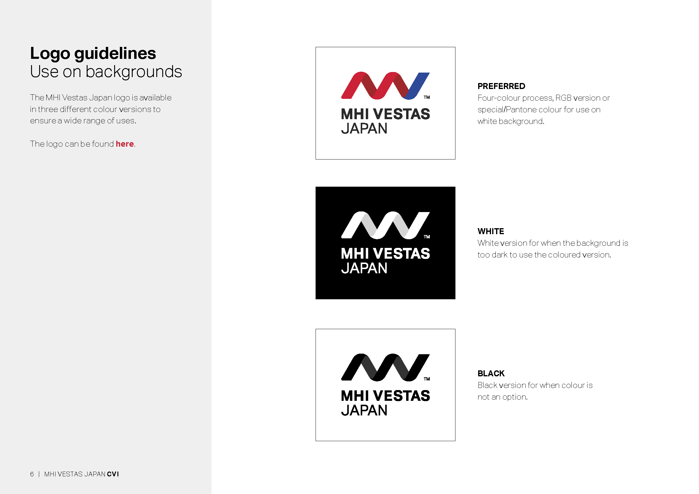

The logo reflects minimalism and simplicity, matching both the Danish and Japanese design traditions. And the colours represent the parent companies, but in a brighter and more modern tone of the red and blue shades, creating a contemporary and forward-looking feel.
Celia Kanstrup Bjerg, Art Director, Cadpeople
The logo
The logo mark is an abbreviation of the names of the two parent companies coming together in a three-dimensional spiral shape that captures what MHI Vestas Japan is all about:
Wind, movement, and driving the roll-out of a greener future.
We have created a CVI booklet that gathers all of MHI Vestas Japan’s design elements and guidelines for how the brand should look and feel. But the CVI booklet also creates space.
Celia Kanstrup Bjerg, Art Director, Cadpeople
PSST… THERE’S MORE.
Thomas Juel
Partner & CSO
Tel +45 2014 6601
tj@cadpeople.dk