THE CHALLENGE
How do we unite the three unique companies, who specialise in wind, production and energy, respectively, and share the same DNA?
THE SOLUTION
Create a powerful brand strategy and update the visual identity, unifying the group while at the same time respecting the uniqueness of the individual company.
Brand strategy and visual identity
In the spring of 2016, we met with a client at that time known as Ringkøbing Maskinværksted to learn more about their business. We learned that they are pioneers in the energy sector, succeeding by producing high-quality products and operating domestically as well as in foreign markets. But despite their success, it proved difficult to keep their communication efforts up to speed with the expansion of the business. We wanted to help the client succeed by streamlining the identity of the group, emphasising the unity of the three parallel companies.
Behind the solution
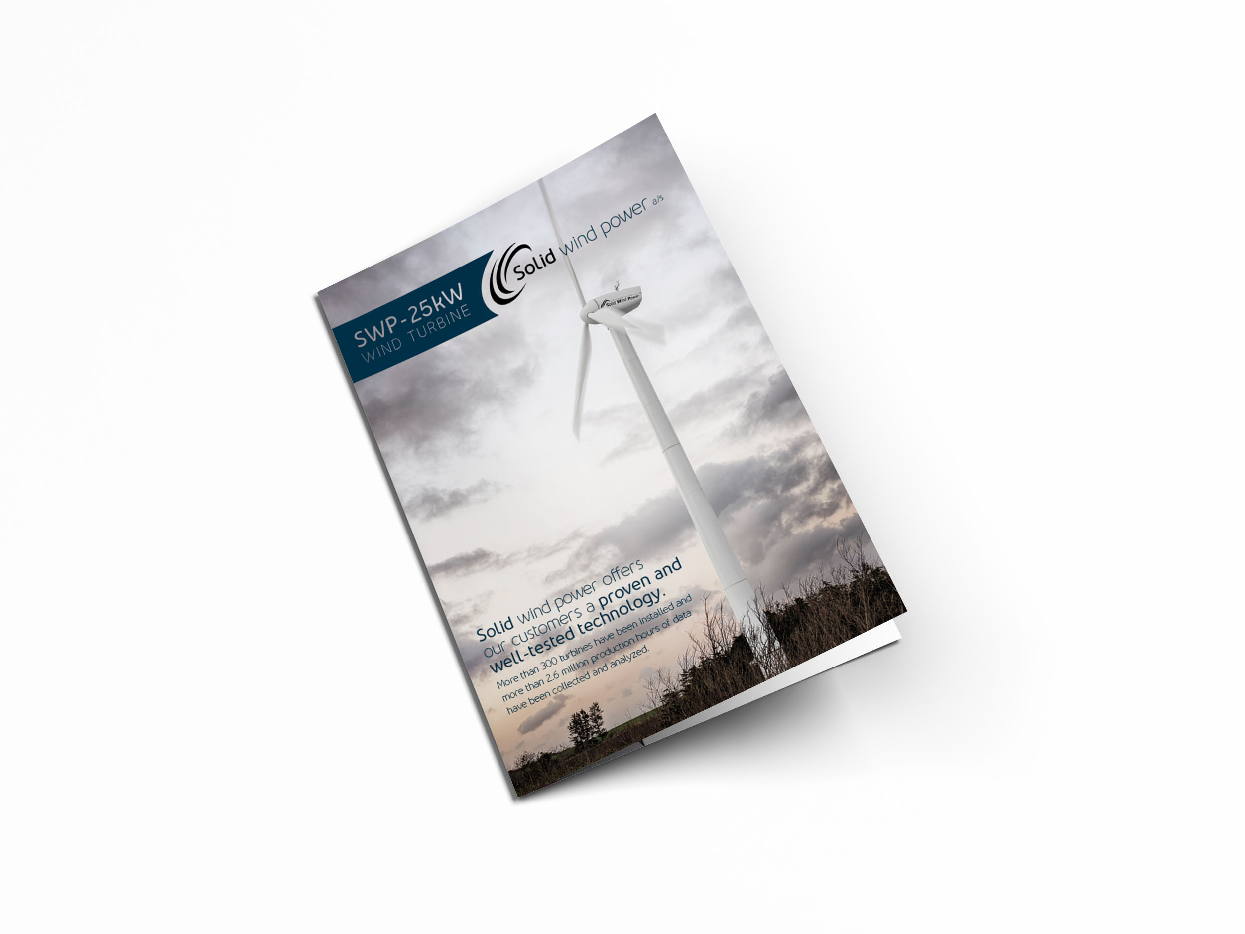
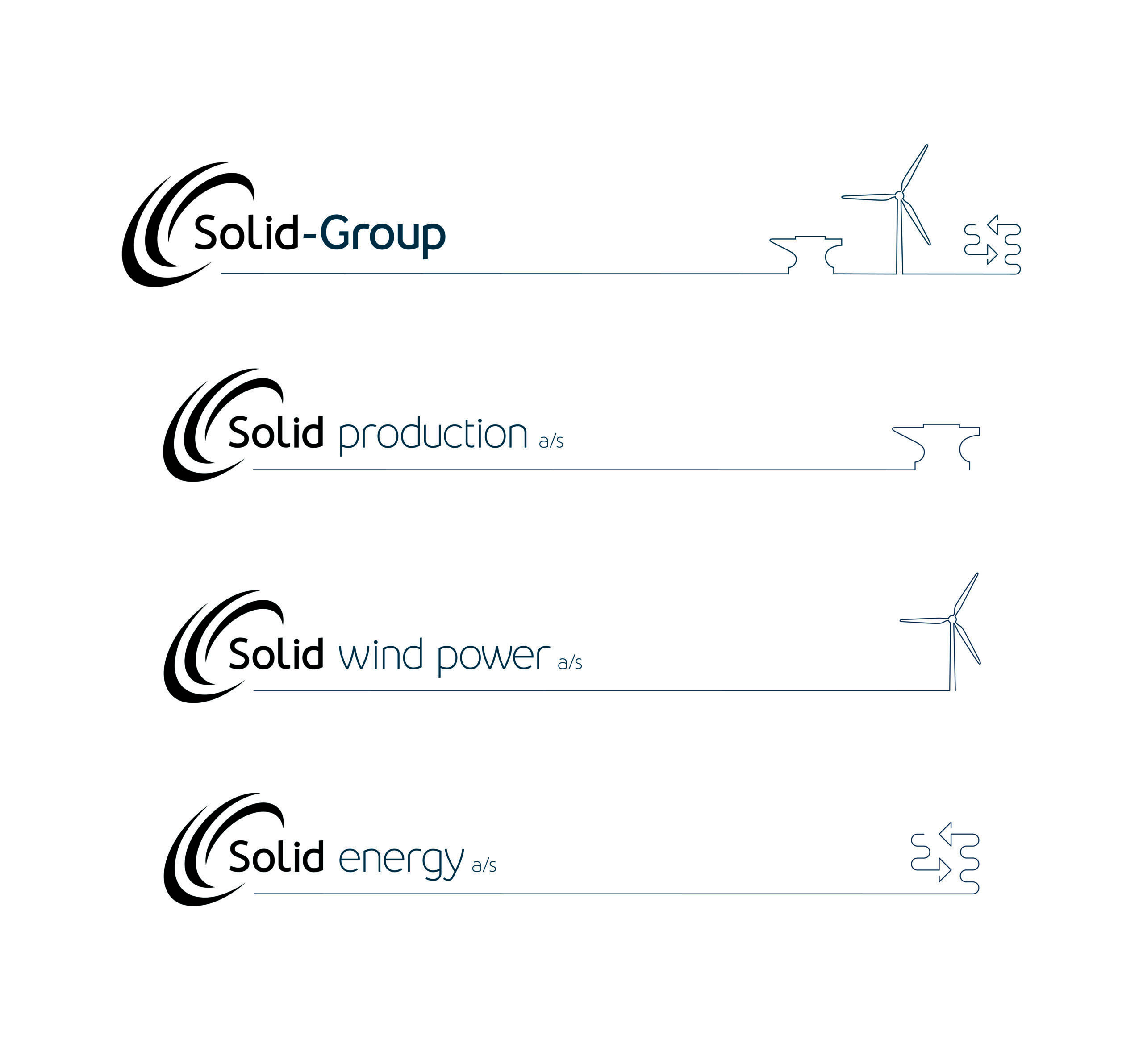
First, we recommended harmonising the group by renaming, so that all companies shared the “Solid” name, and uniting the three companies in a new holding company named Solid Group. This strengthens the overall brand and allows for a more powerful market appearance. Next, we developed a visual concept across all Solid brands. We developed a new logo family, containing individual yet familiar logos for the individual companies and the mother company. Finally, we created unique websites for the three companies and established the kinship of the group with a unifying parent website.
In addition, we were given the green light to create marketing materials for the Solid Group booth at the WindEnergy 2016 Expo. We created the concept for the booth itself, along with a 3D film showcasing their products.
PSST… THERE’S MORE.
Thomas Juel
Partner & CSO
Tel +45 2014 6601
tj@cadpeople.dk